Chapter 11 Maps
Maps in R are best plotted using ggplot - which is good, because we already know how to use that! However, the new thing about maps is the sort of data we’ll be using - as well as having data about certain variables, this data has a location attached to it too.
First, we need to load in the packages we need. We’ll need the following packages:
- tidyverse, as this contains ggplot2 for plotting and dplyr for data manipulation
- rgdal, a package for loading in spatial data
- broom, a package for converting spatial data into dataframes to be plotted in ggplot2
Activity A11.1:
- Install rgdal
- Install broom
- Use library() to load tidyverse, rgdal, and broom
11.1 Loading in geospatial data
Geospatial data comes in three forms:
- Polygons (shapes)
- Lines
- Points
Polygons and points are the most common (geospatial line data only really features when relating to travel infrastructure or people movements), so we’ll focus on these two.
Point, polygon, and line data can come in a number of different data formats, but the msot common is a ‘shapefile’ with a .shp suffix. We can use the rgdal library to load in shapefiles. Firstly, we’re going to load the names of location of major UK cities using the readOGR function.
Make sure you have the shapefiles located in a folder called shps within your data folder first.
## OGR data source with driver: ESRI Shapefile
## Source: "/home/travis/build/dfe-analytical-services/r-training-course/data/SHPs/england_cities.shp", layer: "england_cities"
## with 48 features
## It has 2 fields
Plotted, the cities look like this:
…which looks vaguely like the UK!
You’ll see cities is a SpatialPointsDataFrame class object. The essentially means it’s a dataframe with spatial data attached.
Activity A11.2: Click the blue circle to the left of cities to open up the object. You’ll see there’s an attribute within cities called data, and another attribute called coords.
Access these by typing cities@ and then whichever of the attributes you want to view.
We can also use readOGR to load in polygon data. The file we’re going to use is one containing the boundaries of Local Authorities (LAs) in England, called England_LA_2016.shp.
## OGR data source with driver: ESRI Shapefile
## Source: "/home/travis/build/dfe-analytical-services/r-training-course/data/SHPs/England_LA_2016.shp", layer: "England_LA_2016"
## with 152 features
## It has 8 fields
This is a SpatialPolygonsDataFrame, which makes sense!
However, if we plot the LAs alongside the cities, the don’t match up.
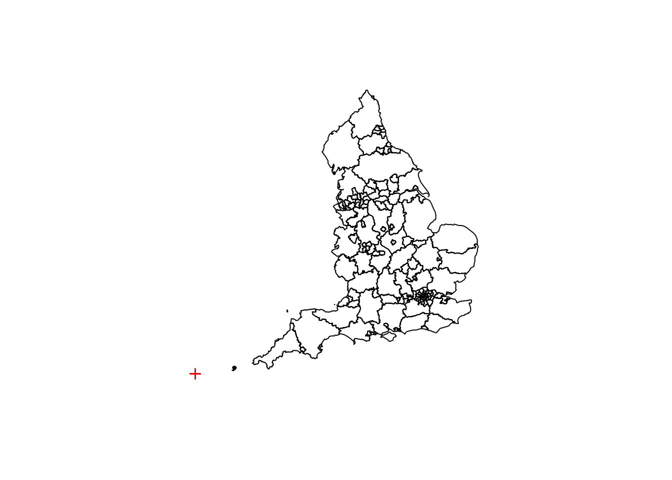
## integer(0)What we have here is all of the city points plotted down in the bottom lefthand corner (although you can only see one) over the LA map. This is because the cities data and the LA data use different ‘coordinate systems’.
11.2 Coordinate systems
At their most basic level, coordinates are just numbers that represent a location, where all the points within that set follow the same form. With that in mind, we can use different sets of numbers, or systems, to represent the location of a point. There are a lot of coordinate systems that are used in mapping, but the most common that you’ll come across when mapping UK data are:
- WGS84 (EPSG4326): This is the standard Latitude and Longitude coordinate system to map global data, developed in 1984. It makes the assumption that the earth is a perfect sphere (it’s actually a bit elliptical - wider at the sides), and Longitude (on the x axis) goes between -180 and 180 (degrees), with 0 being the Meridian Line in Greenwich, London. Latitude (on the y axis) again goes between -180 and 180, with 0 on the Equator.
- OSGB36 (EPSG27700): This is a grid system, with units in metres, specific to the UK. It’s origin is about 100km west of Lands End, roughly level with the most southerly point of the mainland Britain, Lizard Point. It assumes that the British Isles are on a completely flat plane (which of course they aren’t). On the x axis are Eastings and on the y axis are Northings. The largest coordinate value is (800000,1300000).
Tip: The EPSG codes are codees from the now defunct European Petroleum Survey Group, and are a common code for different coordinate systems. These are the codes that we’ll use to change the coordinate systems. For more information on codes click here.
Let’s check which coordinate systems cities and england are on.
## CRS arguments:
##  +proj=longlat +datum=WGS84 +no_defs +ellps=WGS84 +towgs84=0,0,0
So, cities is on WGS84 - we can see from its datum (origin) attribute.
## CRS arguments:
##  +proj=tmerc +lat_0=49 +lon_0=-2 +k=0.9996012717 +x_0=400000
## +y_0=-100000 +datum=OSGB36 +units=m +no_defs +ellps=airy
## +towgs84=446.448,-125.157,542.060,0.1502,0.2470,0.8421,-20.4894
So, england is on OSGB36 - again we can see from its datum attribute.
Therefore, we need to translate one of the coordinate systems into the other. We’re going to convert cities into the OSGB36 coordinate system, because it’s a bit more of an intuitive system to use, using a grid in metres instead of degrees.
Let’s break this down:
- cities is our object name, and the first ingredient in our ‘recipe’ using pipes. We’re essentially updating cities.
- spTransform is a function for transforming spatial objects’ coordinate systems
- CRS stands for ‘Coordinate Reference System’ - this takes an argument which is a string containing the EPSG code of the coordinate system we want to convert to, which in this instance is EPSG27700
Activity A11.1: After you’ve run the code above, recheck which coordinate system cities is on.
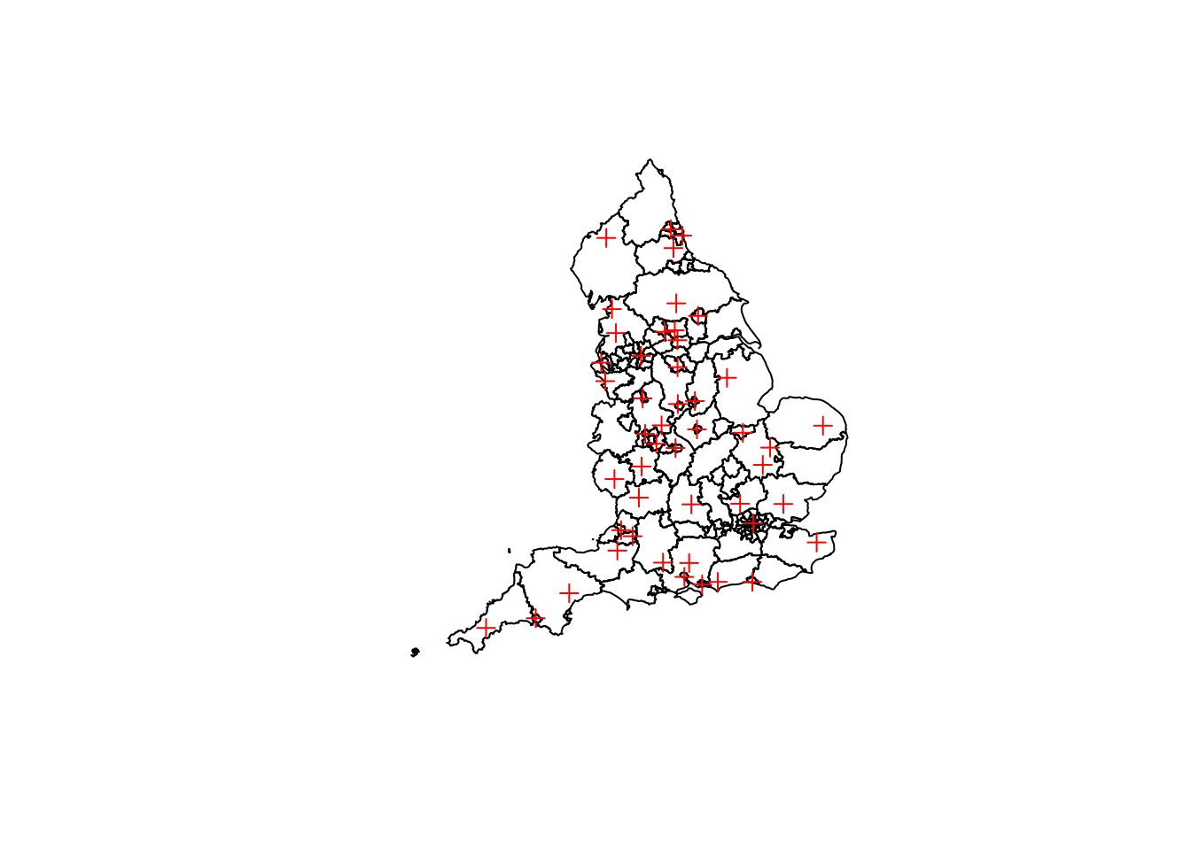
Now if we replot cities and england, we’ll see they line up more as we’d expect.
## integer(0)11.3 Transforming mapping data
As mentioned, we’re going to be using ggplot to plot the maps. However, ggplot takes dataframes, and currently we have spatial dataframes, so that’s not going to fly.
What we need to do is convert our spatial dataframes into normal dataframes. There are two methods for this:
- For point data we can just convert it straight to a normal dataframe, and select the coordinates and any other required columns (e.g. labels)
- For polygon data we need to use a broom function called tidy, which breaks a polygon up into a series of lines, and creates a dataframe where each row is a coordinate of the start of one line and the stop of another, as well as a column detailing which group (in this instance a Local Authority) it’s part of
Let’s deal with the point data first.
cities_df <- cities %>% #Create a dataframe (df) version of cities
data.frame() %>%
select(city=City,
easting = coords.x1,
northing = coords.x2)Which creates something that looks like this:
##         city  easting northing
## 1       Bath 374654.4 164546.7
## 2 Birmingham 405758.2 285421.0
## 3   Bradford 416570.4 431915.0
## 4   Brighton 531128.8 104856.1
## 5    Bristol 359560.8 172496.5
## 6  Cambridge 544754.9 257863.3
Activity A11.2: We need to do a bit of cleaning on this dataframe. Select only three columns, rename coords.x1 as easting and coords.x2 as northing.
With a polygon object, we can’t just use the data.frame function, because unlike a point object, there are multiple coordinates associated with each item in the data slot. So this is where we’re going to use tidy.
england_df <- england %>%
  tidy() %>%
  as.tbl() #We need this function to explicitly specify that that output is a dataframe
Which leaves us with something that looks like this:
## # A tibble: 6 x 7
##      long     lat order hole  piece group id
##     <dbl>   <dbl> <int> <lgl> <fct> <fct> <chr>
## 1 447097. 537152.     1 FALSE 1     0.1   0
## 2 447229. 537033.     2 FALSE 1     0.1   0
## 3 447281. 537120.     3 FALSE 1     0.1   0
## 4 447378. 537095.     4 FALSE 1     0.1   0
## 5 447455. 537024.     5 FALSE 1     0.1   0
## 6 447551. 537078.     6 FALSE 1     0.1   0
There are a few things to notice about this dataframe:
- The tidy function, when applied to spatial objects, automatically names the coordinate columns long and lat. In this instance long is actually easting and lat is actually northing - we’ll change the names in a minute.
- There are three defunct columns for our purposes: order, hole, and piece
- There’s no identifier for a Local Authority (name or code), which is present in the data slot of england. This has been replaced by the id column - each polygon’s points are identified by a unique number in that column.
- When we plot this data, ggplot2 will initially plot each of these polygons as one continuous line. This means that if one polygon does not start (indicated by the order column) at different coordinates to where the previous polygon finished, then a straight line across a polygon will appear (like the example below), connecting the two points. The group column prevents this from happening by not linking polygons in different groups.
ggplot()+
  geom_polygon(data=england_df,
               aes(long,lat),
               col="grey",
               fill=NA) +
  coord_equal() +
  theme_minimal() +
  theme(axis.line=element_blank(),
        axis.text.x=element_blank(),
        axis.text.y=element_blank(),
        axis.ticks=element_blank(),
        axis.title.x=element_blank(),
        axis.title.y=element_blank(),
        panel.background=element_blank(),
        panel.border=element_blank(),
        panel.grid.major=element_blank(),
        panel.grid.minor=element_blank(),
        plot.background=element_blank(),
        legend.title=element_blank())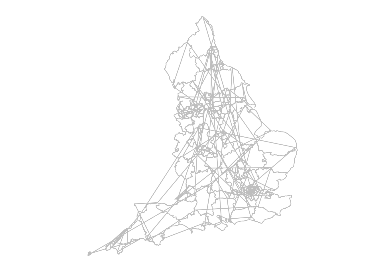
So, we need to create another dataframe which has all the data from england as well as an id column, to match to the dataframe that we’ve just created.
england_data <- england@data %>%
  cbind(england_df %>% select(id) %>% unique()) #Here we're binding the unique values from the id column in england_df to the data slot from england - the order remains the same which is why we can just bind them
This dataframe looks like this:
##      LA15CD               LA15NM LA_Code RSC_Code
## 0 E06000001           Hartlepool     805        5
## 1 E06000002        Middlesbrough     806        5
## 2 E06000003 Redcar and Cleveland     807        5
## 3 E06000004     Stockton-on-Tees     808        5
## 4 E06000005           Darlington     841        5
## 5 E06000006               Halton     876        8
##                      RSC_Name Reg_Code   RGN15CD    RGN15NM id
## 0                       North        9 E12000001 North East  0
## 1                       North        9 E12000001 North East  1
## 2                       North        9 E12000001 North East  2
## 3                       North        9 E12000001 North East  3
## 4                       North        9 E12000001 North East  4
## 5 Lancashire & West Yorkshire        8 E12000002 North West  5
Activity A11.3: Match england_data into england_df, using id and an inner join. Keep the following columns using select: long (renaming it easting), lat (renaming it northing), LA15NM, LA15CD, and group.
11.4 Point maps
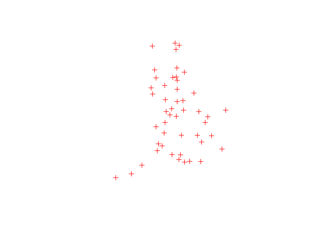
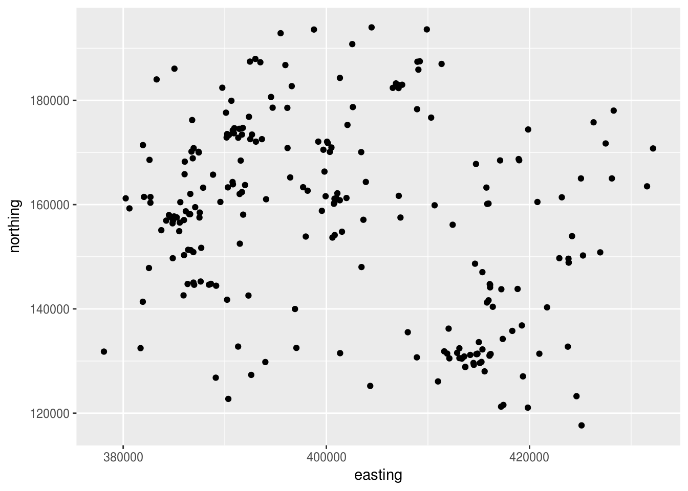
Point maps are useful where you want to show the location of entities with a single location, and attributes/values associated with that entity. In this example we’re going to map all schools within the Local Authority of Wiltshire, along with their phase and size.
First, we want to load in the data we’re going to be using. We’re going to load in the shapefile called wiltshire_schools and transform it in one fell swoop.
wiltshire_schools_df <- "data/shps/wiltshire_schools.shp" %>%
  readOGR() %>%
  data.frame() %>%
  select(easting = coords.x1,
         northing = coords.x2,
         LAEst:P_FT_T)
## OGR data source with driver: ESRI Shapefile
## Source: "/home/travis/build/dfe-analytical-services/r-training-course/data/shps/wiltshire_schools.shp", layer: "wiltshire_schools"
## with 231 features
## It has 53 fieldsTip: If you look at the dataframe, you’ll see the column names have been abbreviated - this is because shapefiles are limited to 8 characters for column names. However, we can refer to swfc_16_init to work out what the column names are.
We can now finally plot some data!
So, we’ve plotted some data, but it doesn’t look overly map like. Let’s break down what we’ve written first, and then we’ll make it look more like a map:
- ggplot(): The standard function, but notice here it has no arguments. This is because ggplot2 also allows you to specify your data and aesthetics from within the type of plot you’re displaying. This is really useful when you’re plotting different types of graphs from different data sources on the same coordinate system.
- geom_point: We’ve seen this before with scatter plots - it’s the same thing applied to spatial point data.
- data=wiltshire_schools_df: This is the data we’re using, the quirk here is that when specifying data within the type of plot as opposed to from within ggplot we need to explicitly specify the name of the argument, with data=.
- aes(easting,northing): Standard aesthetics, plotting the Easting and Northing of each plot
Now let’s makr it look more like a map. The first thing we can do is make the coordinates an equal scale (currently the x-axis is more stretched than the y-axis), and get rid of the grey background, the grid lines, and then axis labels.
ggplot() +
geom_point(data=wiltshire_schools_df,aes(easting,northing)) +
coord_equal() +
theme(axis.line=element_blank(),
axis.text=element_blank(),
axis.ticks=element_blank(),
axis.title=element_blank(),
panel.background=element_blank(),
panel.border=element_blank(),
panel.grid.major=element_blank(),
panel.grid.minor=element_blank(),
plot.background=element_blank())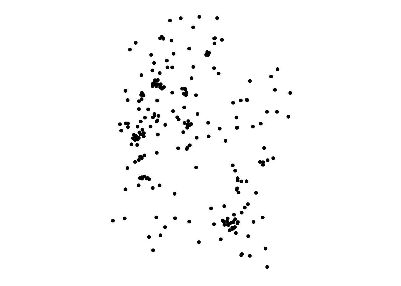
There’s a lot to specify in the theme function, but once you’ve written it once you can copy it again and again (or even write a function to make it more concise/robust!).
That’s looking more map-like! What would really help is the border of Wiltshire. To do that we need to get a subset of england_df which only contains coordinates which bound Wiltshire:
We can then add a polygon to our map:
ggplot() +
  geom_polygon(data=wiltshire_df,aes(easting,northing),col="grey",fill=NA) +
  geom_point(data=wiltshire_schools_df,aes(easting,northing)) +
  coord_equal() +
  theme(axis.line=element_blank(),
        axis.text=element_blank(),
        axis.ticks=element_blank(),
        axis.title=element_blank(),
        panel.background=element_blank(),
        panel.border=element_blank(),
        panel.grid.major=element_blank(),
        panel.grid.minor=element_blank(),
        plot.background=element_blank(),
        legend.title = element_blank())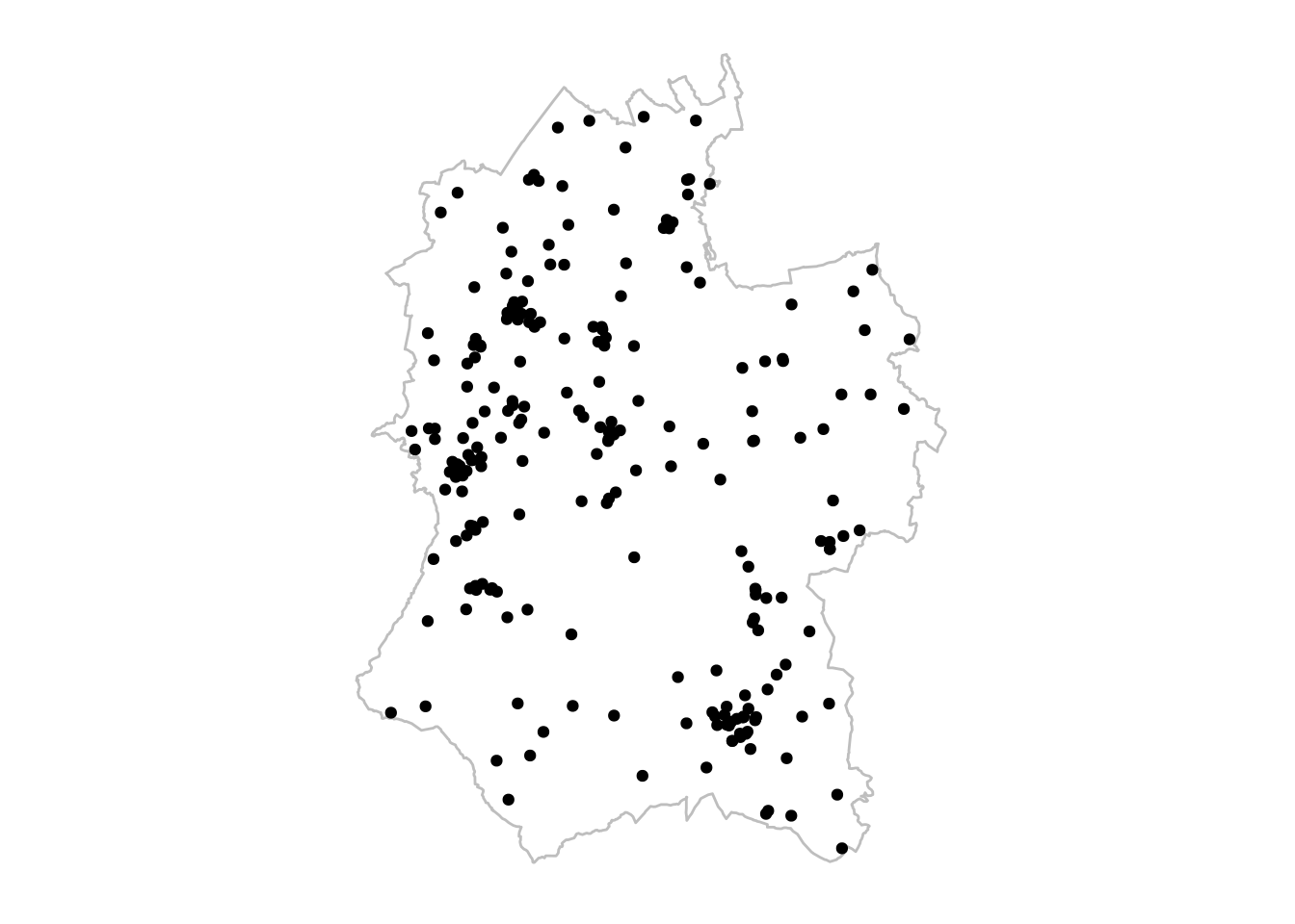
That’s more like it! Let’s break down what we’ve got:
- geom_polygon: This plots a polygon
- data=wiltshire_df,aes(easting,northing): We’ve seen this format before
- col=“grey”,fill=NA: We want a grey outline and no fill colour
Notice how we plot the polygon first - this is because ggplot2 builds up layers on top of each other, so we want the points on top of the polygon.
The final thing we need to do is add some attributes to the points. This uses the same arguments we’ve used in plotting graphs.
Activity A11.4: Use col= and size= in the aesthetics in geom_point to detail the phase of the school (column name Sch_P in wiltshire_schools_df) and the size of the school’s workforce (column name T_W_H in wiltshire_schools_df)
Tip: Add in legend.title = element_blank() to get rid of the legend title and legend.key = element_rect(fill=NA) to get rid of the grey backgrounds behind the legen - both just make it look a bit more professional!
11.5 Chloropleth maps
The other type of map that we’re going to look at are chloropleth maps. Chloropleth maps are maps of multiple polygons with each polygon filled in with a certain colour/hatching depending on a certain attribute/value.
A chloropleth map uses similar code to a point map. We’re going to plot a map which has the average total workforce for schools in each Local Authority on it.
However, the first thing we need to do is to attach data on the average school workforce for each Local Authority from swfc_16 to england_df.
## Warning: Column `LA15NM`/`LA_Name` joining factors with different levels,
## coercing to character vector
This gives us a dataframe that looks like this:
## # A tibble: 6 x 6
##   easting northing group LA15CD    LA15NM     ave_tot_workforce
##     <dbl>    <dbl> <fct> <fct>     <chr>                  <dbl>
## 1 447097.  537152. 0.1   E06000001 Hartlepool              67.2
## 2 447229.  537033. 0.1   E06000001 Hartlepool              67.2
## 3 447281.  537120. 0.1   E06000001 Hartlepool              67.2
## 4 447378.  537095. 0.1   E06000001 Hartlepool              67.2
## 5 447455.  537024. 0.1   E06000001 Hartlepool              67.2
## 6 447551.  537078. 0.1   E06000001 Hartlepool              67.2
We can plot a simple chloropleth:
ggplot()+
geom_polygon(data=england_df,
aes(easting,northing,group=group,fill=ave_tot_workforce),
col="grey") +
coord_equal() +
theme(axis.line=element_blank(),
axis.text=element_blank(),
axis.ticks=element_blank(),
axis.title=element_blank(),
panel.background=element_blank(),
panel.border=element_blank(),
panel.grid.major=element_blank(),
panel.grid.minor=element_blank(),
plot.background=element_blank(),
legend.title = element_blank())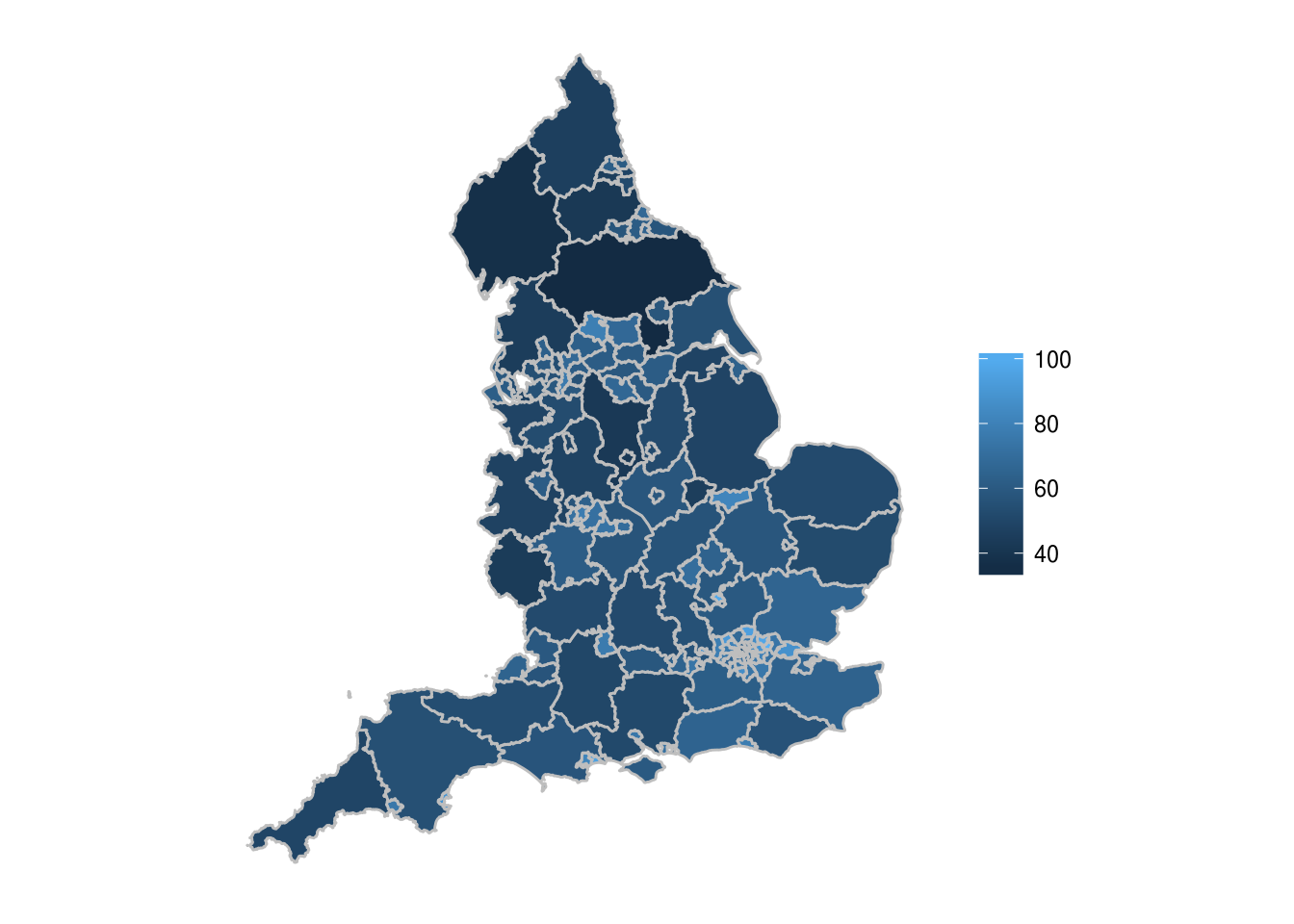 The two key differences to a point map are:
- The use of the group argument, to remove lines across polygons to connect them all
- The use of the fill argument with the ave_tot_workforce, which fills each Local Authority polygon with a colour corresponding to its value
The key thing that our chloropleth map is currently missing is some sort of reference to actual locations. However, we’ve got our city point data which we can add in, along with text labels. We have to build this up in two stages, so the first thing we’ll add in are the points:
ggplot()+
  geom_polygon(data=england_df,
               aes(easting,northing,group=group,fill=ave_tot_workforce),
               col="grey") +
  geom_point(data=cities_df,
             aes(easting,northing),
             col="red") +
  coord_equal() +
  theme(axis.line=element_blank(),
        axis.text=element_blank(),
        axis.ticks=element_blank(),
        axis.title=element_blank(),
        panel.background=element_blank(),
        panel.border=element_blank(),
        panel.grid.major=element_blank(),
        panel.grid.minor=element_blank(),
        plot.background=element_blank(),
        legend.title = element_blank())
So we’ve plotted the location of the cities, using geom_point, which we’ve used before. To add the labels we need to use a new function however, called geom_text.
ggplot()+
  geom_polygon(data=england_df,
               aes(easting,northing,group=group,fill=ave_tot_workforce),
               col="grey") +
  geom_point(data=cities_df,
             aes(easting,northing),
             col="red") +
  geom_text(data=cities_df,
            aes(easting,northing,label=city),
            check_overlap = TRUE,
            col="red",
            hjust = 1.1,
            vjust=0.3) +
  coord_equal() +
  theme(axis.line=element_blank(),
        axis.text=element_blank(),
        axis.ticks=element_blank(),
        axis.title=element_blank(),
        panel.background=element_blank(),
        panel.border=element_blank(),
        panel.grid.major=element_blank(),
        panel.grid.minor=element_blank(),
        plot.background=element_blank(),
        legend.title = element_blank())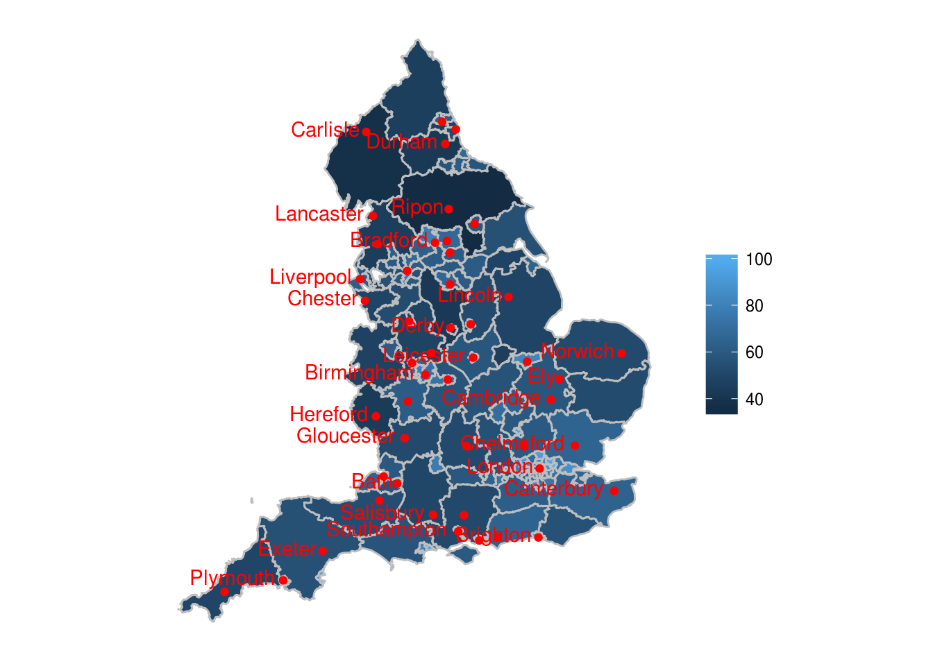
Let’s break geom_text down:
- We’ve seen data= and the first two arguments of aes before
- label=city adds a text label of a certain value to the coordinates detailed in easting and northing
- check_overlap = TRUE checks if a each label overlaps with a previous label, and if it does, it won’t plot it. For example, ‘Bristol’ overlaps with ‘Bath’, so because Bristol comes after Bath, it isn’t plotted.
- col = “red” makes the text colour red
- hjust = 1.1 and vjust=0.3 make adjustments to the horizontal and vertical position of the label in relation to the point. This has been done so that the label doesn’t sit right on top of the point.