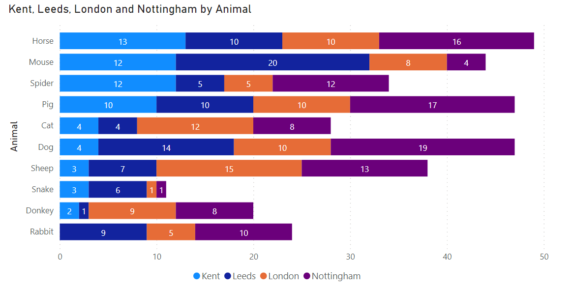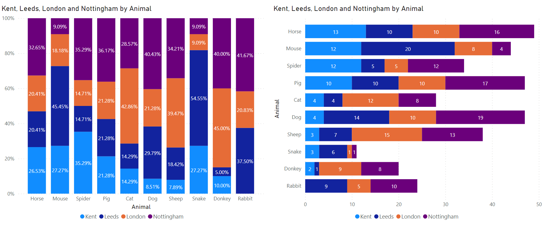
Chapter 5 Visualisations
The basic elements of the report are visualisations, standalone images, and text boxes. A report can have one or more report pages and all the pages together are collectively known as the report.
5.1 Things to avoid
Any component or visualization that is not directly contributing to the message should be removed and includes:
Navigation - Dashboards work best when they can be understood in a glance. Do you need to include navigation options on your dashboard to drill down, drill through or filter the information on there? For easier navigation make sure to include search options in filters where possible
Non-essential text - Avoid unnecessary labeling and instructions. Avoid using acronyms and technical jargon that will be confusing for the user
Too much colour – Use the standard government colour guidelines (see links section)
3-Dimensional objects - Avoid at all cost because the additional angles create another cognitive barrier, which can lead to misinterpretation of data.
Horizontal or vertical grid lines - In some instances grid lines are useful, but overusing them detracts from the data
Too much detail – Causes distraction (e.g. £1.25m, instead of £1,254,345.67)
Too many visuals can be a bad thing and make the insight we’re trying to provide confusing rather than useful
5.2 Simple, concise and easy to understand
Modellers should not use visuals that require explanations for the user.
Visuals should adhere to the following guidelines:
Position elements that require the reader to make a choice to the left of the visualizations the choice will impact (e.g. slicers)
Position related elements close to each other as this implies the elements are related
Make important elements larger than the others or add a visual element like an arrow to draw attention
Add a border, colour background or white space around related elements. Conversely, add a divider to distinguish between different sections of a report
Fill the report page. If you find that you have a lot of extra white space, consider make your visualizations larger or make the canvas smaller, although remember that white space can be useful for preventing your dashboard from looking cluttered/complicated.
Align the elements on the report page, either symmetrically or intentionally asymmetrically – pixel alignment in the format pane is useful for doing this

Some visuals are better than others when it comes to make data (and trends) clear!
5.3 Titles and labelling
The titles, labels, headings and footnotes should follow these conventions:
Order columns by a field – e.g. highest value, academic year
Shade columns/rows in tables for emphasis.
Tables should have meaningful headings.
Headings and totals should be in a bold font.
Borders (if needed) should be black or in the ESFA Data Science theme (navy blue)
5.4 Numbers
To help the reader make comparisons:
When comparing numbers, try to ensure they are physically close together
Series of numbers are easier to compare in columns
Place numeric columns at the right-hand side, text to the left.
Align numbers to the right (unless this looks confusing)
Use the same level of precision
Decimals less than one should always begin with a zero (e.g. 0.5, not .5)
Format numbers with commas between thousands (e.g. 1,000)
Format numbers with units
Format percentages to one decimal place and in italics (e.g. 0.5%)
Format large numbers for easy reading (e.g. £234,000 – no need for pennies)
5.5 Rounding
Making a decision on rounding can be difficult when the values show a variety of magnitudes. If so, consider rounding to a fixed number of significant figures.
The extent of rounding will depend on the intended use: a commentator may be content to report that the population of the UK is 64m, or that this has changed from 63.7m to 64.1m. An analyst performing further calculations will want to work with figures that are more precise.
Use dynamic rounding (via DAX) to avoid reducing precision of totals and sub-totals.
5.6 Ordering categories
Ordering the categories in a table is a very effective way of aiding rapid interpretation.
5.7 Filters
Filters should be located in a set area of the report page, consistently across all pages. These should be drop down filters as they save vital space and will look consistent.

Drop down filters sit at the top of the report page, allowing for easy filtering of the visuals below.
5.8 Interactions
At the time of writing, the default interactions for any page report is one of two variations, all depending on the type of visualisation involved. Some of the visuals default to a filter functionality whereas other visuals use the highlight method.
Use the cross-filter and cross-highlight option to interact with other visualizations on the page or to sync with visualisations on other pages, where appropriate.
5.9 Colour
Colour can fundamentally change how we understand the information in graphs and tables.
Use colour sparingly and with restraint:
Never use colour to specify something on its own
Colours are most effective when they are not overused - only use different colours when they represent helpful differences of meaning in the data

The order of the colours in the legend follow the order of the colours in the visual.
Be consistent in your use of colour:
- Use the same colour to mean the same thing in a series of graphs

Colours are consistent across multiple charts.
Use colour logically in sequences:
- For sequences of colours, ensure that these progress in a way that the user would expect (e.g. in luminance order)
Consider accessibility:
- Colour blindness affects the ability to distinguish between some groups of colours (especially reds and greens). Using DfE accepted colours will enhance their experience.
Foreground colour:
Confine use of colour to foreground items in graphs to draw attention to specific features
Avoid using white as a foreground colour in graphs. It should also be avoided on maps unless it represents “no data”
Background colour:
Effective use of colour applies as much to annotation and background as it does to data elements like bars and lines
In general, background colour should be avoided in tables unless it is to provide subtle highlighting
Use a white background:
Most colour palettes are designed to appear on a white background as it provides a helpful reference “anchor” for the visual system
The only functional reason to use a non-white background is for viewing the image in the dark
Use grey palettes for drawing and labelling axes and annotation
Do not use images as backdrops in graphs or tables, as they distract the reader
Colours on line graphs:
- Graphs with more than four lines are hard to follow, even with variations in line texture and shading. A better approach to visualise five or more lines is to use multiple single plots
5.10 Bookmarks
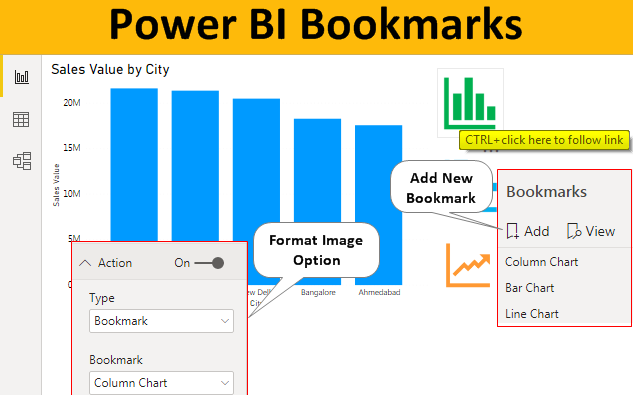
Bookmarks help you capture the currently configured view of a report page, including filtering and the state of visuals, and later let you go back to that state by simply selecting the saved bookmark.
The following elements are saved with the bookmark:
Current page
Filters
Slicers, including slicer type (for example, dropdown or list) and slicer state
Visual selection state (such as cross-highlight filters)
Sort order
Drill location
Visibility (of an object, using the Selection pane)
The focus or Spotlight modes of any visible object
You can also create a collection of bookmarks, arrange them in the order you want, and subsequently step through each bookmark in a presentation to highlight a series of insights, or the story you want to tell with your visuals and reports.
Bookmarks can be used to create pop-up windows, clearing filters, tabbed navigation, expand/collapse menus, page navigation and so much more.

Bookmarks can be used to save a certain state of visuals. Graphic taken from https://www.wallstreetmojo.com/
5.11 Tooltips
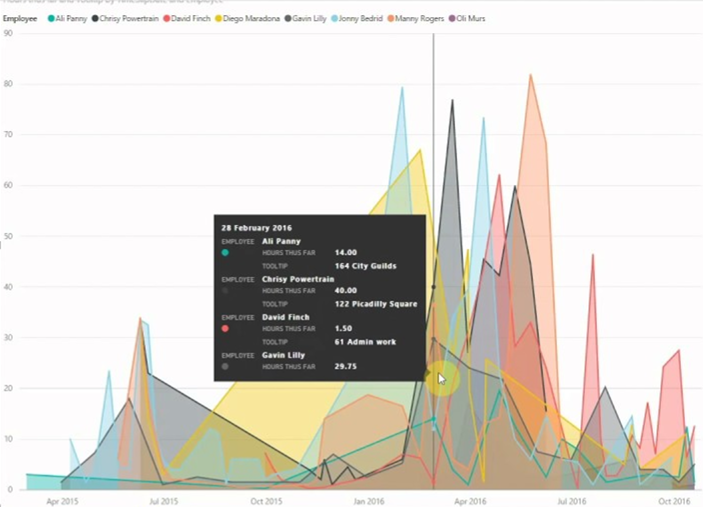
Tooltips are an elegant way of providing more contextual information and detail to data points on a visual. When a visualization is created, the default tooltip displays the data point’s value and category. Custom tooltips enable you to specify additional data points that display as part of the tooltip, simply by dragging a field into the tooltips bucket. You can also create report pages to serve as your tooltip and so include visuals, images, and any other collection of items in those pages.
Each tooltip page can be associated with one or more fields in your report. Thus, when you hover over a visual that includes the selected field, the tooltip you created on your tooltip page appears when you hover over the visual, filtered by the data point over which your mouse is hovering.
There are limitations to report tooltips. These are not noted here, as Power BI is continually evolving its capabilities.

Tooltips can provide more context for visuals. Example taken from Power BI Academy on Youtube